


Welcome to the comprehensive guide on Email Design, a crucial element in the digital marketing landscape that can significantly influence the success of your campaigns. This blog post is designed to unravel the complexities of Email Design, providing you with insights, strategies, and best practices to create effective and engaging emails. Whether you’re a seasoned marketer or just starting out, our key takeaways and in-depth discussions will empower you to craft emails that not only look great but also resonate with your audience and drive results. Let’s dive into the world of Email Design and explore how to make your emails stand out in a crowded inbox.
Table of Contents
Key Takeaways
| Section | Key Takeaways |
|---|---|
| Introduction to Email Design | Understanding the importance and impact of email design in engaging audiences and boosting campaign success. |
| Crafting the Perfect Subject Line | Strategies for creating engaging and concise subject lines that entice readers to open the email. |
| Choosing the Right Fonts | Importance of font selection in conveying brand message and ensuring readability across devices. |
| Color Psychology in Email Design | How color choices in emails can influence reader’s emotions and actions, and reflect brand identity. |
| Incorporating Brand Elements | Consistency in using logos, colors, and voice to reinforce brand recognition and trust in emails. |
| Layout and User Experience | The significance of a well-organized layout and intuitive design in enhancing user interaction and readability. |
| Visual Content and Graphics | Using high-quality images and graphics to make emails more engaging and convey information effectively. |
| Responsive Design for All Devices | Ensuring emails look good and function properly on all devices to provide a consistent user experience. |
| Effective Call-to-Action Placement | Strategically placing clear and compelling CTAs to guide users towards the desired action. |
| Email Design Best Practices and Examples | A roundup of best practices in email design and real-world examples illustrating these principles. |
| FAQs: Common Questions | Answers to common questions about email design, providing insights and practical tips for readers. |
Part 1: Understanding Email Design Fundamentals
Introduction to Email Design

In the ever-evolving digital landscape, Email Design stands as a crucial pillar in the edifice of digital marketing. It’s not merely about crafting messages; it’s an art and science that harmoniously blends aesthetics with functionality. This introductory guide aims to demystify the concept of Email Design, paving the way for marketers and designers alike to understand its profound significance in engaging audiences and driving successful campaigns.
The Essence of Email Design
At its core, Email Design transcends the basic arrangement of text and images. It encapsulates an immersive experience, tailored to resonate with recipients on a personal level. The design of an email determines how effectively your message is communicated, how it is perceived, and ultimately, the action it inspires. In this age of information overload, a well-designed email can be the beacon that guides your audience through the cluttered inboxes to your message.
The Harmony of Visuals and Content
A pivotal aspect of Email Design is the seamless integration of visuals and content. The choice of colors, typography, and imagery must align with the brand’s identity, creating a cohesive and recognizable visual language. This visual storytelling not only captivates but also reinforces brand recognition and loyalty.
User Experience: The Heart of Email Design
The user experience (UX) in Email Design is about understanding and anticipating the needs of the recipient. It’s about crafting emails that are not just visually appealing but also intuitive and easy to navigate. The layout, the call-to-action (CTA) placement, and even the white space usage, all contribute to an effortless and enjoyable user journey.
The Technical Artistry
Email Design also encompasses a blend of technical artistry. It requires a deep understanding of responsive design to ensure that emails render perfectly across a myriad of devices and email clients. This technical proficiency ensures that the creative vision for the email is flawlessly executed, regardless of how or where it is viewed.
Conclusion
As we embark on this journey through the intricate world of Email Design, remember that it’s more than just a task; it’s an opportunity to connect, engage, and inspire. With each email, you have the power to create a unique and memorable experience for your audience. Embrace the creativity, understand the technicalities, and always keep the user experience at the forefront.
Crafting the Perfect Subject Line

In the dynamic world of Email Design, the power of a well-crafted subject line is undeniable. It’s the first point of engagement, the initial lure that can make or break the effectiveness of your email. Mastering the art of the subject line is essential in capturing the attention of your recipients and encouraging them to delve deeper into your message.
The Art of First Impressions
The subject line is your audience’s initial encounter with your email. It’s a critical component in Email Design, acting as a make-or-break moment for the success of your email campaign. A compelling subject line should encapsulate the essence of your message, intriguing the recipient enough to prompt an open.
Personalization: The Key to Connection
In Email Design, personalization in subject lines goes beyond mere name-dropping. It’s about creating a connection, tapping into the recipient’s preferences, history, or interests. Personalized subject lines resonate more deeply, increasing the likelihood of engagement.
Clarity and Creativity: Striking a Balance
Balancing creativity with clarity is a subtle yet crucial aspect of Email Design. Your subject line should spark interest without sacrificing the clear understanding of the email’s content. This balance helps in building trust and sets the right expectations.
Brevity: Less is More
Brevity is a golden rule in Email Design, especially for subject lines. With limited space and the ever-decreasing attention spans of recipients, a concise and catchy subject line can significantly increase open rates.
Optimization through Testing
A/B testing is an invaluable tool in Email Design for fine-tuning subject lines. This practice allows you to experiment with different phrases, tones, and structures to discover what resonates best with your audience, leading to more effective email campaigns.
Conclusion
The subject line is a fundamental element in Email Design, serving as the deciding factor for the success of your email campaigns. By focusing on personalization, clarity, creativity, brevity, and continuous optimization, you can significantly enhance the impact of your email marketing efforts. A compelling subject line can make all the difference. For an in-depth exploration of crafting subject lines that captivate, don’t miss our complete guide to email subject lines
Choosing the Right Fonts
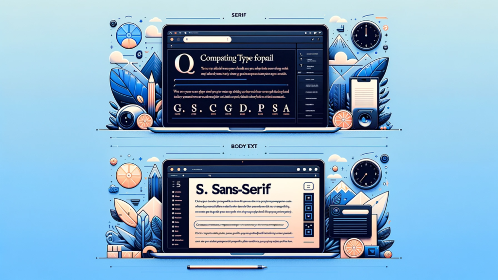
In the nuanced world of Email Design, the choice of fonts is more than just a stylistic decision; it’s a strategic one. Fonts have the power to set the tone, convey a message, and significantly impact the readability and effectiveness of your email. Let’s delve into the art of selecting the perfect font for your email campaigns, an aspect often overlooked yet vital in the realm of Email Design.
Understanding Font Psychology
Every font tells a story. In Email Design, understanding font psychology is key to aligning your text with your message’s intended emotion and tone. Whether you’re aiming for a professional, playful, or persuasive tone, the right font can make all the difference. The choice of serif or sans-serif, for instance, can subtly influence how your audience perceives your message.
Web-Safe Fonts: A Necessity
In the practical world of Email Design, the concept of web-safe fonts is crucial. These are fonts that are widely available across different platforms and devices, ensuring consistency and readability of your emails regardless of where they’re viewed. Sticking to web-safe fonts like Arial, Verdana, or Times New Roman is a safe bet to maintain visual integrity.
Font Pairing for Harmony
Font pairing is an art in Email Design. It involves combining multiple fonts in a way that is aesthetically pleasing and functionally effective. The key is to find fonts that complement each other while ensuring that your email’s hierarchy and structure are clear. A bold serif for headings paired with a simple sans-serif for body text can create a dynamic yet coherent look.
Legibility and Accessibility
The primary goal of your email’s text is to be read. In Email Design, ensuring that your fonts are legible and accessible to all users, including those with visual impairments, is paramount. This means avoiding overly decorative fonts and ensuring adequate font size and line spacing for easy reading.
Testing and Responsiveness
In the versatile arena of Email Design, testing how your chosen fonts perform across various devices and email clients is essential. Responsiveness is key – your fonts must maintain their legibility and formatting whether your email is viewed on a desktop, tablet, or smartphone.
Conclusion
Choosing the right fonts in Email Design is a blend of understanding psychology, ensuring web safety, mastering font pairing, prioritizing legibility, and rigorous testing. By carefully selecting fonts that align with your brand and message, you can significantly enhance the effectiveness of your email campaigns.
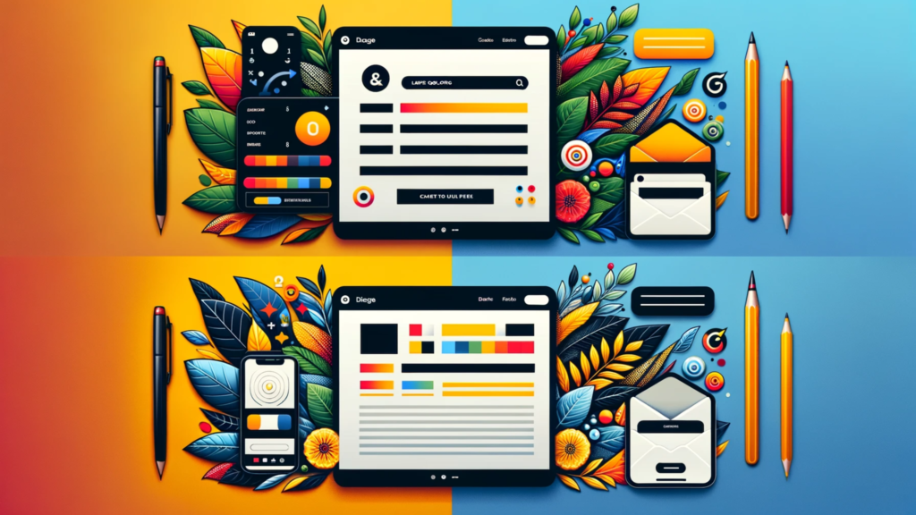
Color Psychology in Email Design
The strategic use of color in Email Design is a powerful tool in the arsenal of digital marketing. It’s not just about making an email look attractive; it’s about leveraging color psychology to evoke emotions, convey messages, and drive engagement. This section delves into the intricate world of color psychology within Email Design, exploring how the right color palette can transform your email campaigns.
The Emotional Palette of Colors
In the realm of Email Design, colors are more than mere decoration; they are communicators. Each color carries an emotional weight and can trigger specific responses. For example, blue conveys trust and reliability, making it a frequent choice for corporate emails. Red, known for its urgency and energy, is often used for calls-to-action. Understanding these emotional associations is key to selecting colors that align with your message and brand identity.
Brand Consistency and Recognition
Color consistency is pivotal in Email Design. The colors used in your emails should be in harmony with your brand’s overall color scheme. This consistency not only strengthens brand recognition but also ensures a cohesive user experience across all marketing channels. When recipients see your brand’s colors, they should immediately associate them with your brand, reinforcing trust and familiarity.
Enhancing Readability and Hierarchy
Colors play a crucial role in enhancing the readability and visual hierarchy in Email Design. Contrasting colors can be used to draw attention to key elements like headlines and calls-to-action. Similarly, background and text colors need to be chosen carefully to ensure that the email is easy to read and navigate. The right color contrast can significantly improve user experience and guide the reader’s eye through the content.
Cultural Considerations in Color Choice
It’s essential to acknowledge the cultural connotations of colors in Email Design. Colors can have different meanings in different cultures, and what works for one audience may not resonate with another. A thorough understanding of your target audience’s cultural background can inform a more empathetic and effective color strategy.
A/B Testing for Color Optimization
As with every element of Email Design, testing is crucial. A/B testing different color schemes can provide valuable insights into what resonates best with your audience. This data-driven approach allows for continuous refinement of your email’s visual strategy, ensuring optimal engagement and response.
Conclusion
The thoughtful application of color psychology in Email Design can profoundly impact the effectiveness of your email campaigns. By understanding the emotional language of colors, maintaining brand consistency, enhancing readability, respecting cultural nuances, and continuously testing and optimizing, you can create emails that not only capture attention but also evoke the desired response from your audience.
Incorporating Brand Elements
In the multifaceted world of Email Design, incorporating brand elements is not just about aesthetics; it’s a strategic move to build recognition and trust. This facet of Email Design intertwines the essence of your brand with every email you send, ensuring that each message reinforces your brand identity. Let’s explore how effectively integrating brand elements can elevate your email campaigns.
Brand Identity: The Heart of Your Emails
At the core of Email Design lies your brand identity. This includes your logo, brand colors, and the unique voice that characterizes your communications. These elements should be consistently represented in your emails to create a seamless experience for the recipient. When your emails reflect your brand identity, they become more than just messages; they become extensions of your brand story.
Consistent Use of Logos and Colors
Incorporating your logo and brand colors in Email Design is crucial for instant recognition. Your logo should be prominently placed, and your brand colors should be used strategically to highlight key areas like headers, footers, and call-to-action buttons. This consistent use of brand elements ensures that every email strengthens your brand’s visual memory in the recipient’s mind.
Typography as a Brand Ambassador
Typography in Email Design goes beyond readability. The fonts you choose should align with your brand’s personality. Whether it’s professional and authoritative or casual and friendly, your typography should reflect the tone of your brand, creating a cohesive and recognizable look across all communications.
Brand Voice: Consistency in Communication
Your brand’s voice is a crucial element in Email Design. It’s about how you communicate, not just what you communicate. This voice should be consistent in all your emails, whether they are promotional, informational, or transactional. A consistent brand voice helps build a relationship with your audience, making your brand more relatable and trustworthy.
Imagery and Visual Storytelling
The imagery used in your emails is a powerful tool for visual storytelling in Email Design. It should resonate with your brand’s values and message. High-quality, relevant images can capture attention, evoke emotions, and reinforce your brand narrative, making your emails more engaging and memorable.
Interactive Elements Reflecting Brand Personality
Interactive elements like videos, GIFs, and infographics can add a dynamic layer to your Email Design. These elements should not only be engaging but also reflect your brand’s personality. They offer an opportunity to showcase your brand’s creativity and innovation, making your emails stand out in a crowded inbox.
Conclusion
Incorporating brand elements into Email Design is pivotal in creating a strong brand presence in your email campaigns. From logos and colors to typography and voice, each element plays a significant role in building brand recognition and loyalty. By thoughtfully integrating these aspects, your emails can become powerful tools in telling your brand’s story and connecting with your audience.
Layout and User Experience
When it comes to Email Design, the layout is not just about arranging elements; it’s about crafting an experience. A well-thought-out layout enhances the user experience (UX), making your email not just a message, but a journey for the recipient. In this exploration of layout and UX in Email Design, we will delve into how an intuitive and engaging layout can significantly boost the effectiveness of your email campaigns.
The Power of a Well-Planned Layout
In the art of Email Design, the layout serves as the blueprint of your message. A clear and logical structure guides the recipient through the content seamlessly. This means strategically placing your most important messages at the top, using an F-pattern or Z-pattern layout to align with natural reading habits. The goal is to create a flow that feels natural and effortless, leading the reader from the subject line to the call-to-action with ease.
Responsiveness: A Cornerstone of UX
In today’s mobile-first world, responsiveness in Email Design is non-negotiable. Your email must look and function flawlessly across all devices – smartphones, tablets, and desktops. This adaptability ensures that no matter how your audience accesses their email, the experience remains consistent, reinforcing the effectiveness of your message.
Visual Hierarchy: Guiding the Eye
Visual hierarchy in Email Design is all about using size, color, and layout to influence what the reader sees first and next. The most critical information should jump out, while secondary information should support without overwhelming. This strategic arrangement of elements ensures that your key messages are never missed.
Whitespace: The Unsung Hero of UX
Whitespace, or negative space, is a crucial yet often overlooked component of Email Design. It’s not merely empty space; it’s a powerful tool to reduce clutter, increase readability, and draw attention to the most important parts of your email. Effective use of whitespace can transform an email from overwhelming to inviting.
Interactive Elements: Enhancing Engagement
Incorporating interactive elements like hover effects, animated GIFs, or clickable buttons adds a dynamic dimension to Email Design. These elements not only make your email more engaging but also improve UX by making the email not just a message to read, but an experience to interact with.
Testing for Optimized UX
In the dynamic field of Email Design, what works for one audience may not work for another. Regular testing and tweaking of your layout can provide insights into user preferences and behaviors. This continuous optimization process is key to ensuring your emails provide the best possible user experience.
Conclusion
In Email Design, the layout is a critical component in shaping the user experience. A well-designed layout, characterized by responsiveness, clear visual hierarchy, effective use of whitespace, and interactive elements, can significantly enhance the impact of your email campaigns. By focusing on these aspects, you can create emails that are not only visually appealing but also exceptionally user-friendly.
Part 2: Advanced Email Design Strategies
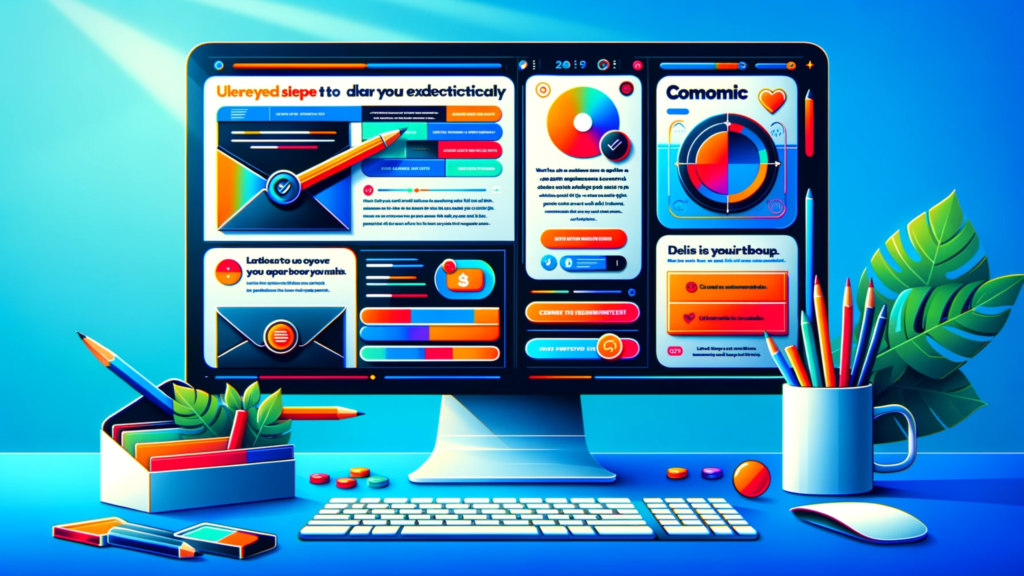
Visual Content and Graphics
In the vibrant landscape of Email Design, visual content and graphics play a pivotal role in captivating your audience and enhancing your message. These elements are not mere embellishments; they are powerful tools that, when used effectively, can transform your email from a simple communication into an engaging visual narrative. Let’s dive into how integrating visual content and graphics can revolutionize your Email Design.
The Impact of Imagery
In the world of Email Design, images do more than fill space; they evoke emotions, tell stories, and create connections. High-quality, relevant imagery can instantly grab attention and make your email more memorable. Whether it’s a striking photograph, a sleek illustration, or an informative infographic, the right image can convey your message more powerfully than words alone.
To delve deeper into how you can transform your campaigns with advanced strategies, including the use of visuals, explore our comprehensive guide on 10 advanced email marketing strategies.
Graphics: Conveying Complexity with Simplicity
Graphics in Email Design serve as a bridge between complex ideas and your audience. Icons, charts, and illustrations can simplify complex information, making it more digestible and engaging. Thoughtfully designed graphics not only break the monotony of text but also aid in better comprehension of the message.
Balancing Text and Visuals
A key aspect of effective Email Design is striking the right balance between text and visuals. Overloading an email with images can overwhelm the reader, while too little can make it dull and unengaging. The trick is to use visuals to complement and enhance the text, not overshadow it.
Brand Consistency in Visuals
Consistency in visuals is crucial in Email Design. Your graphics and images should align with your brand’s aesthetic and color palette, reinforcing brand identity. Consistent visual branding helps in building recognition and trust with your audience, making your emails instantly recognizable.
Animated Elements: Adding a Dynamic Touch
Animated elements like GIFs can add a dynamic touch to your Email Design. They’re a great way to draw attention to key points or calls-to-action and can make your email stand out in a crowded inbox. However, it’s important to use animation sparingly and ensure it aligns with your message and brand tone.
Optimizing for Load Time and Compatibility
In Email Design, it’s essential to optimize visual content for quick load times and compatibility across various email clients. Large, unoptimized images can slow down email loading, potentially leading to lower engagement. Ensuring your visuals are optimized for both desktop and mobile devices is key to a smooth user experience.
Conclusion
Visual content and graphics are indispensable in the art of Email Design. They enrich the storytelling, enhance message clarity, and elevate the overall aesthetic of your emails. By thoughtfully integrating imagery, balancing visuals with text, maintaining brand consistency, and optimizing for user experience, you can create emails that are not only visually stunning but also deeply engaging.
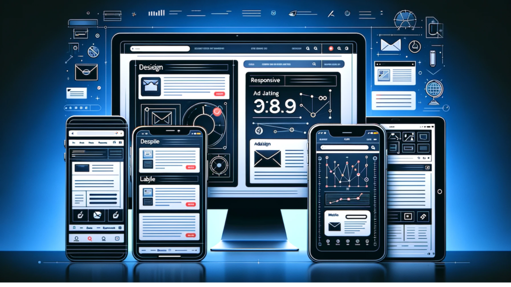
Responsive Design for All Devices
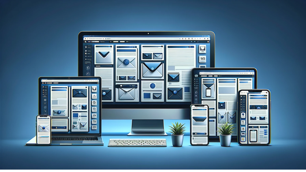
In the ever-evolving digital world, Responsive Design has become a cornerstone of effective Email Design. With a multitude of devices at our fingertips, from smartphones to tablets and desktops, ensuring your email looks impeccable on every screen is not just a luxury, but a necessity. This section will explore the significance of responsive design in Email Design and how it can be masterfully executed to reach your audience on any device.
Adapting to the Multi-Device Era
The era of multi-device usage demands adaptability in Email Design. Responsive design is about creating emails that automatically adjust their layout, images, and content to fit the screen size and resolution of every device. This adaptability ensures a consistent and optimal viewing experience, whether your audience is checking their email on the go or from the comfort of their home office. Responsive design is just one piece of the larger puzzle of email marketing. To fully grasp how to engage your audience, delve into our comprehensive guide on understanding email marketing.
Fluid Layouts: The Backbone of Responsiveness
At the heart of responsive Email Design are fluid layouts. These flexible layouts use percentages rather than fixed pixel sizes, allowing the email content to resize and reflow depending on the screen size. This approach ensures that your email maintains its structural integrity and readability across all devices.
Scalable Images and Media Queries
Responsive Email Design also involves using scalable images and media queries. Scalable images ensure that visuals remain clear and undistorted on any screen size. Media queries, a staple of responsive design, enable the email to detect the recipient’s device and load the appropriate layout and content. This smart adaptation elevates the user experience to new heights.
Typography That Responds
In responsive Email Design, typography plays a pivotal role. Font sizes and line spacing must be flexible to ensure text is legible on smaller screens. Responsive typography involves using relative units like ’em’ or ‘rem’ instead of fixed units like ‘pixels,’ allowing text to scale harmoniously with the screen size.
Testing Across Devices and Platforms
The mantra of successful responsive Email Design is ‘test, test, and test again.’ Rigorous testing across a range of devices and email clients is essential to ensure consistency. This testing process helps identify and rectify any issues that could hinder the user experience, ensuring your email is accessible and engaging for every recipient. Discover how marketing automation can streamline this process and enhance your email campaigns by visiting our marketing automation page.
Conclusion
Responsive design in Email Design is no longer optional; it’s integral to reaching and engaging a diverse, tech-savvy audience. By embracing fluid layouts, scalable images, adaptable typography, and thorough testing, you can ensure that your emails are not just seen, but also experienced in the best possible way, regardless of the device used. This commitment to excellence in responsive design is key to successful email campaigns in our multi-device world.
Effective Call-to-Action Placement

In the intricate tapestry of Email Design, the Call-to-Action (CTA) is not just a button or a line of text; it’s the culmination of your email’s purpose. An effectively placed CTA can significantly influence the success of your email campaign, guiding your audience towards the desired action. This exploration will focus on the strategic placement and optimization of CTAs within the realm of Email Design.
The Power of a Well-Placed CTA
In Email Design, a CTA is more than a mere prompt; it’s the bridge between interest and action. The placement of your CTA can make a profound difference in its performance. Ideally, it should be positioned where it naturally draws the reader’s eye, following the flow of the content. This strategic positioning ensures the CTA is both noticeable and inviting, encouraging more clicks and interactions. Learn more about optimizing your campaigns in our detailed email marketing automation guide.
Visibility and Accessibility
Visibility is key in effective CTA placement in Email Design. Your CTA should stand out but still feel like an integral part of the email’s design. This means considering contrast, color, and size to make the CTA prominently visible without disrupting the overall aesthetic. Accessibility is equally important; the CTA must be easy to click on all devices, especially on smaller screens where finger-friendliness is essential.
Contextual Relevance
The relevance of your CTA in the context of your email’s content is crucial in Email Design. A CTA that aligns seamlessly with the message enhances its persuasiveness. It should feel like a natural next step for the reader, offering a clear and compelling reason to take action. Personalizing the CTA based on the reader’s previous interactions or preferences can further increase its effectiveness.
The Art of Persuasive Copy
The copy used in your CTA is an art in Email Design. It should be concise, action-oriented, and imbued with a sense of urgency or value. Words like “Discover,” “Start,” “Join,” or “Learn” can be powerful motivators. Crafting a CTA that resonates with your audience’s desires and needs can dramatically improve click-through rates.
Testing for Optimization
In Email Design, what works for one audience may not work for another. A/B testing different placements, designs, and copies for your CTAs can provide invaluable insights. This process of testing and refinement is crucial in finding the most effective CTA strategy for your specific audience and objectives.
Conclusion
Effective CTA placement in Email Design is a blend of strategic positioning, visibility, contextual relevance, persuasive copy, and continuous optimization. By mastering these elements, you can transform your CTAs from mere buttons into powerful catalysts for engagement and conversion, driving the success of your email campaigns.
Once you’ve mastered these aspects and are looking to further refine your skills or seek inspiration, HubSpot’s comprehensive guide offers a wealth of knowledge. Discover the key elements of compelling email design with HubSpot’s ultimate guide to email design and best practices. This guide will help you stay ahead of the curve by providing the latest insights and examples of effective email design.
In the next section, we’ll explore how email design best practices play a crucial role in continually improving your email design…
Email Design Best Practices and Examples
Navigating through the intricate world of Email Design requires a blend of creativity, strategy, and adherence to best practices. It’s about crafting emails that not only capture attention but also deliver a memorable experience. In this exploration, we dive into the essential best practices of Email Design, coupled with real-world examples that illustrate these principles in action.
Clarity and Simplicity
A cardinal rule in Email Design is to keep the design clear and simple. Overcomplicated layouts or too much content can overwhelm recipients, leading to disengagement. The key is to focus on a clean layout with a clear hierarchy, making it easy for recipients to absorb the message at a glance. For instance, Apple’s email campaigns are a classic example of this approach, showcasing their products with minimalistic design and straightforward messaging.
Consistency in Branding
Consistency in branding is crucial in Email Design. Your emails should be a reflection of your brand’s identity, using consistent colors, fonts, and tone. This approach builds brand recognition and trust over time. A great example is Airbnb’s emails, which seamlessly mirror their website’s look and feel, reinforcing their brand identity.
Personalization and Segmentation
Personalizing emails goes beyond inserting the recipient’s name. In Email Design, it involves tailoring content to individual preferences, behaviors, and needs. Segmenting your audience allows for more targeted and relevant emails. Netflix excels in this area, sending personalized recommendations based on viewing history, making each email feel tailor-made.
Mobile Responsiveness
With the increasing use of mobile devices for email, mobile responsiveness in Email Design is non-negotiable. Emails should render well on all devices, ensuring a consistent experience. Companies like Buzzfeed excel in this, with emails that are as readable and engaging on a mobile screen as they are on a desktop.
Engaging Visuals
Visuals are a powerful tool in Email Design. They should complement the text, not overpower it. Using high-quality images, infographics, or even videos can enhance your message and engage your audience. For example, National Geographic’s emails are renowned for their stunning imagery, drawing readers into their world.
Effective CTA Placement
The placement and design of the CTA in Email Design can significantly impact conversion rates. CTAs should be prominent, clear, and enticing, prompting the recipient to take action. Dropbox does this effectively by using bold, contrasting colors for their CTA buttons, making them stand out in the email.
Testing and Analytics
Continuous testing and analysis are vital in Email Design. A/B testing different design elements can reveal what resonates best with your audience, allowing for continual improvement of your email campaigns. Amazon is known for its data-driven approach, constantly refining its emails based on user interactions.
Conclusion
Mastering Email Design involves a careful balance of aesthetics, functionality, and adherence to best practices. By drawing inspiration from successful examples and continuously refining your approach based on data and feedback, you can create emails that not only look great but also effectively communicate your message and engage your audience. After exploring various design best practices, stay ahead by keeping an eye on the future. Check out the latest email marketing trends to watch and ensure your strategies remain cutting-edge.
FAQs on Email Design
In the world of digital marketing, Email Design is a critical component that can significantly influence the success of your campaigns. With its complexities and nuances, it’s natural to have questions. This section addresses some of the most common questions about Email Design, providing insights and answers to help you navigate this important area.
What is Email Design?
Email Design refers to the process of strategically creating and arranging content in an email. This includes the layout, colors, images, typography, and other elements that make up the visual and functional aspects of an email. The goal is to make the email not only visually appealing but also easy to read and interact with, ultimately driving engagement and action.
Why is Responsive Email Design important?
Responsive Email Design ensures that your email looks good and functions well on any device, from desktops to smartphones. With a significant number of users accessing emails on mobile devices, responsive design is crucial for maintaining readability, usability, and overall user experience. It helps prevent issues like cut-off text, unclickable links, or images that don’t load correctly, which can negatively impact your campaign’s effectiveness.
How can I make my email design more engaging?
To make your Email Design more engaging, focus on creating a clean and intuitive layout, use compelling visuals, and include interactive elements like buttons or links. Personalize content to make it more relevant to the recipient, and use persuasive and clear calls-to-action (CTAs) to guide users towards the desired action. Additionally, keep your content concise and interesting to maintain the reader’s attention.
What are some common mistakes in Email Design?
Common mistakes in Email Design include overcrowding the email with too much text or too many images, using inconsistent branding, neglecting mobile responsiveness, and having unclear or too many CTAs. Other errors include using hard-to-read fonts, not testing the email across different email clients and devices, and failing to optimize images, leading to slow load times.
How important are CTAs in Email Design?
CTAs are extremely important in Email Design as they guide the recipient towards the action you want them to take, such as making a purchase, signing up for a service, or reading more content. A well-designed CTA that stands out and clearly states what the reader will gain can significantly increase click-through and conversion rates.
Can I use any font in my Email Design?
While you can technically use various fonts in your Email Design, it’s best to stick with web-safe fonts that are widely supported across email clients and devices. This ensures that your text appears consistently and as intended, without fallback issues. Popular web-safe fonts include Arial, Verdana, Times New Roman, and Georgia.
How do I test my Email Design?
Testing your Email Design involves checking how it looks and functions across various email clients (like Gmail, Outlook, etc.) and devices (desktop, tablet, smartphone). Use email testing tools that can simulate different environments. Also, consider A/B testing different design elements (like colors, layout, CTAs) to see what performs best with your audience.
Conclusion
Understanding the intricacies of Email Design is crucial for creating effective email campaigns. By addressing these common questions and continuously learning and adapting, you can enhance your skills in crafting emails that not only look great but also drive results.
Conclusion: Embracing the Art and Science of Email Design

As we wrap up this comprehensive journey through the world of Email Design, it’s clear that crafting effective emails is both an art and a science. It’s about blending aesthetics with functionality, creativity with strategy, and vision with best practices. The goal is not just to create emails that look good but to construct experiences that resonate, engage, and ultimately drive action.
Email Design is a dynamic field, constantly evolving with new trends, technologies, and user expectations. Staying informed and adaptable is key. Remember, every email is an opportunity to connect with your audience, reflect your brand’s identity, and achieve specific business objectives. The strategies and insights discussed in this guide are your tools to maximize the potential of every campaign.
Here are some final thoughts to keep in mind as you continue your email design journey:
- User-Centric Design: Always put the user’s experience at the forefront of your design process. Understand their preferences, behaviors, and needs to create emails that truly resonate.
- Consistency and Branding: Your emails are an extension of your brand. Maintain consistency in branding elements like logos, colors, and voice to build recognition and trust.
- Test and Learn: Embrace A/B testing and analytics to understand what works best for your audience. Continuous learning and adaptation are crucial for long-term success.
- Creativity and Innovation: Don’t be afraid to experiment with new layouts, formats, and interactive elements. The most memorable emails often break the mold.
- Community and Learning: Stay connected with the email design community, learn from others’ successes and failures, and keep up with industry best practices and emerging trends.
In conclusion, mastering Email Design is a journey of continual learning and improvement. With each email, you have the chance to captivate, inform, and inspire. Use the insights and best practices from this guide as a foundation, but never stop exploring, testing, and evolving. Your next email could be your most effective yet. Here’s to creating emails that not only reach inboxes but also touch hearts and minds. Happy designing!